Writing is a long and painful process. Whenever you write something you know it’s about re-writing. You need to correct mistakes and make sure your tone of voice is aligned with your audience. You often need to follow a certain structure, like a letter, quiz, recipe, or proposal. Your text needs to have a certain length. Sometimes it needs to be connected with other source texts, for example when you write an academic paper.
Although Chat GPT offers a brilliant piece of technology, it doesn’t focus on specific scenarios. And because it’s new and open-ended, it might be difficult for common people to write good prompts that will give the expected results. In other words, you need to know how to speak to AI so it could write what you want.
The goal of Growth Engine as a tech company was to adjust Chat GPT’s technology for specific writing use cases.
The goal for East Banc Technology as their consultant was to make sure that technology solves actual users’ problems and that the application is pleasant and intuitive.
Design Process
As an early-stage startup, Growth Engine had many ideas. But needed help with systematizing them and making decisions.
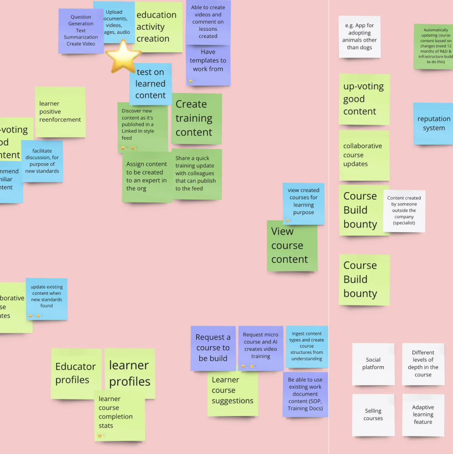
We started with a Product Canvas workshop. During the workshop, we wanted to define what are the goals of the application, who are their potential users and what their needs are, what would be features we want to have in an MVP (Minimum Viable Product), and what is nice to have but not essential (outside of MVP scope).
Following the workshop, the client came to the realization that they would benefit from a more robust business case and the guidance of someone with a strong background in business.
They came back to us after 1 month with a new business-focused team member. They decided to focus on preparing teaching materials for salespeople. We suggested doing more research. Competitors’ research to understand what is already in the market and user interviews to understand how training for salespeople is done in different companies and what are the problems connected with it.
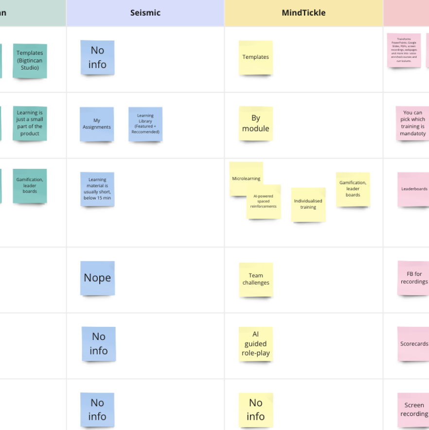
We analyzed their main competitors and took into consideration things like content creation tools, organizing and managing content, content delivery, and assessments. We also took a deeper look into the interfaces of competitors’ applications.

We combined our and our client’s knowledge and assumptions to create research questions. This was used to interview sales managers to understand training struggles.
During the interviews, we discovered that modern salespeople use mostly their computers for work. Smartphones are usually not a part of their equipment and most of them don’t use TikTok. The software they use for their work, like Salesforce, is complex and used on desktop computers therefore the training screen recordings will be too small on the mobile screen.
With the help of the findings from our research, the client arrived at the realization that their initial concept of using TikTok for training was not the optimal approach. Consequently, they made the strategic decision to pivot away from targeting salespeople and explore other alternatives. They took some time to rethink their idea and came to us with a set of wireframes.
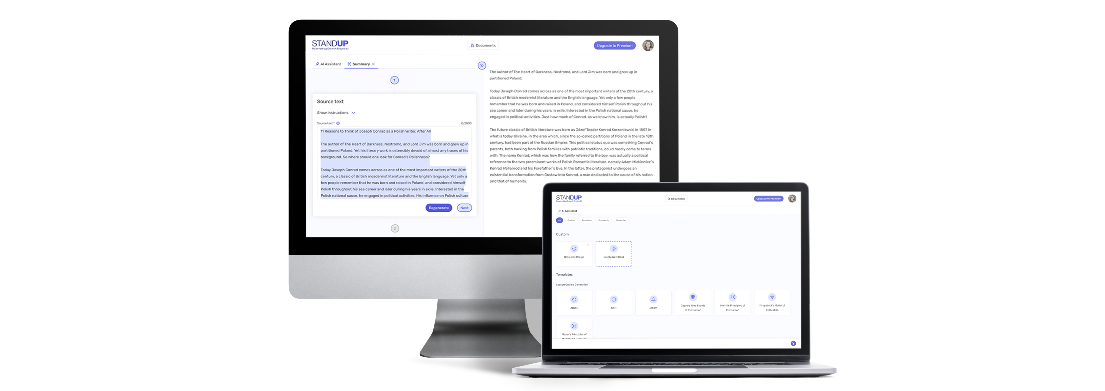
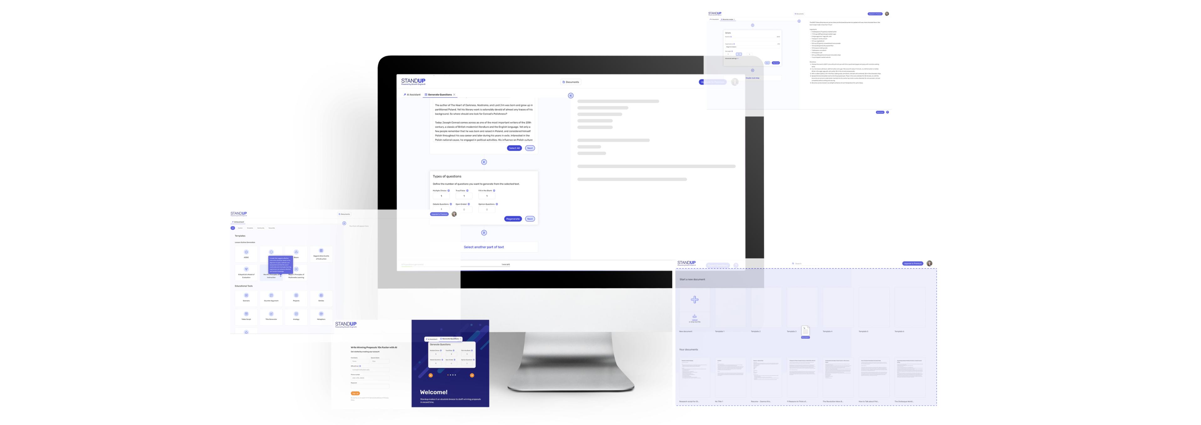
They decided to build a desktop application for generating questions, lesson outlines, summaries, writing proposals, and creating custom text formulas for repetitive use cases. Due to time constraints, our client decided to take a more agile approach. Instead of extensive research, they wanted to build an MVP quickly and then adjust it according to the users’ feedback.
To understand other text-generating and editing applications, we did a quick competitive research. We looked at applications like Google Docs, Grammarly, Jasper, and Rytr. The goal was to understand the interface patterns and create an application easy and intuitive for our users.
Standup - that’s the application’s name, it didn’t have any branding, only a logo. So we took care of the color palette, typography, icon styles, and other building elements to create a scalable design system and consistent interfaces.
With the design system set, we started building the applications’ interfaces. According to agile methodologies it was an ongoing collaboration with the development team. We were meeting twice a week to discuss use cases and get feedback. The development of the app was concurrent with the design process.
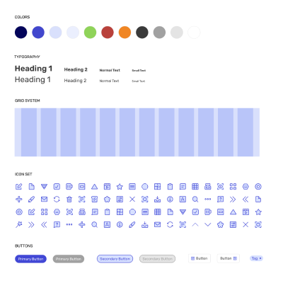
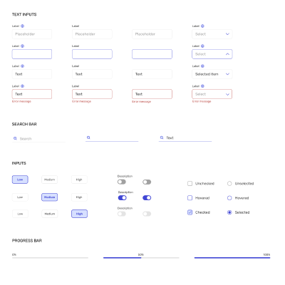
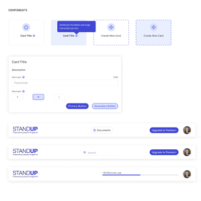
The result of our collaboration with Growth Engine was a clickable prototype showcasing the main functionality of the product which helped software engineers build an MVP.
The product is live and available on standupai.com.
