Simple is good. Simple is clean. And whether I’m cooking or planning a trip, simple is always better, right? So why do so many companies make user experience (UX) so complex? Bad UX design is all around us – from car audio/navigation systems with complicated user interfaces (UI) to websites and apps that don’t let you tab between fields.
How does bad UX and UI happen? And what can we do to make it better?
As a project manager, to me UX design has always been some kind of mythical combination of art and technology that only designers could pull off. But as I worked through building wireframes, managing implementations, and even providing constructive feedback, on my projects, I realized that UX design couldn’t be that magical if so much of it out in the wild was this complex.
My theory? By integrating UX design practices in your Agile team, you can achieve more intuitive UI.
Although UX design and Agile culture are two different animals, they can complement each other – and across the board, team members can pick up new skillsets, so it’s a win-win.
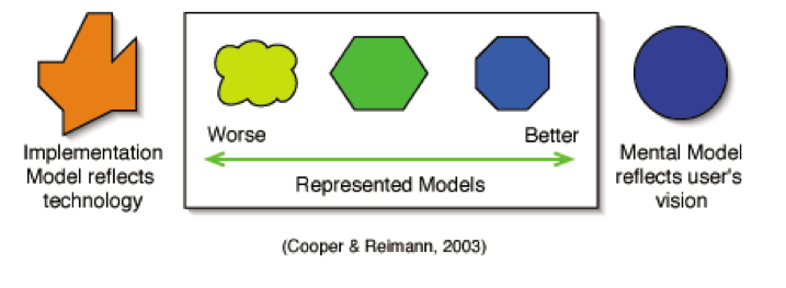
Now, back to the problem. There are basically two schools of thought – the implementation model, which emphasizes building around technology and often represents what’s going on in the system/app/website; and the mental model, built around the end users’ vision of how a system/app/website should work. The first indication of poor UX design is any execution that leans too heavily toward the implementation model.
However, it would seem that many developers have lost sight of what the “U” in UX stands for.
Great UX and UI live in a space called the represented model, where it’s the goal of the designer is to get as close to possible to a user’s mental model. So by design, the closer the represented model is to the mental model, the easier it is to use. But, where do you start?

Luckily, you don’t have to be a UX guru to start uncovering your users’ mental models.
Start your research small. Within your Agile team, find people interested in trying UX design practices and research techniques with real users. This user research is the essential and first step in the UX design process, and it can help you enhance the UX design of your products built within the Agile environment.
From that point, the type of research depends on your needs – qualitative research like observation, for example, would work well for green-field projects. As little as five users per user segment is enough to get relevant results – better still, it won’t take much time, or sacrifice the team’s agility.
Then use your research results to construct your product Information Architecture and design – and then validate your basic wireframes with users to ensure you’re on the right track.
“Information architecture is the practice of deciding how to arrange the parts of something to be understandable.”
-The Information Architecture Institute
This is often where complexity and confusion slip in, as a variety of factors sometimes rush teams to put a “pixel-perfect” finish to a work in progress. At this point, it actually makes more sense to keep the process lightweight, and make do with wireframes developed within the Agile team. Then, engage visual designers to provide the UI style guide.
So, as it turns out, simplifying your UX comes from streamlining your process: understand your users and your goals, let those be your guide, then apply information architecture and information design, as well as light visual design principles.
In short? Don’t forget what the “U” means. It doesn't get any simpler than that.